
PORTRA 400 V.S. ULTRAMAX 400

Figuring out what film stock is right for you can be a challenging task. More often than not there isn’t a “one size fits all” option for us. Film stocks all vary from one another whether it be color, grain, latitude, or light sensitivity. We get a lot of new film shooters who ask us what we recommend for their first roll of film or they ask what the “best” film is. What we recommend changes as we ask everyone what they shoot, however, while there isn’t an overall best film, there is one film that stands out as a kind of “jack of all trades” which would be the Kodak Portra series.
Kodak Portra comes in a variety of speeds ranging from 160, 400 & 800. This film is aimed for the “pro” meaning its very consistent if you shoot it; you know every time you’re going to get the impressively similar results. Even with the ranging sensitivities the film matches, the same color and latitude across all of them making it very easy to be shooting Portra 400 mid-day and switch to Portra 800 when the light starts to dim. The film was mainly intended for portraits hence the name “Portra” however we think you can shoot it in any setting and get great quality images.
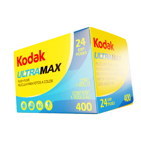
Though we do tend to lean to this answer as a “best film”, if you’re on a budget, wanting something different, or just shooting film more casually we highly recommend Kodak Ultramax! It’s a 400 speed color film, unlike Portra it doesn’t come in multiple speeds. Think of it as a big brother to Kodak Gold 200 which is another cheaper color film. Ultramax tends to be a bit more saturated than Portra, it also has more grain and less latitude but the latitude difference isn’t massive, Color Negative films tend to have really good latitude, even those that are considered consumer grade. Unlike Portra, Ultramax is a film really made for any scenario, where as Portra can be used for anything but was intended mainly for portraits.
Note: Before we get into looking at these two films side by side, we shot these rolls on the same camera with the same lens at the same settings and then developed and scanned them on our Frontier SP-3000 and did NOT try to match them. We did minimal adjustments to make the scenes look how we remembered them looking in real life.
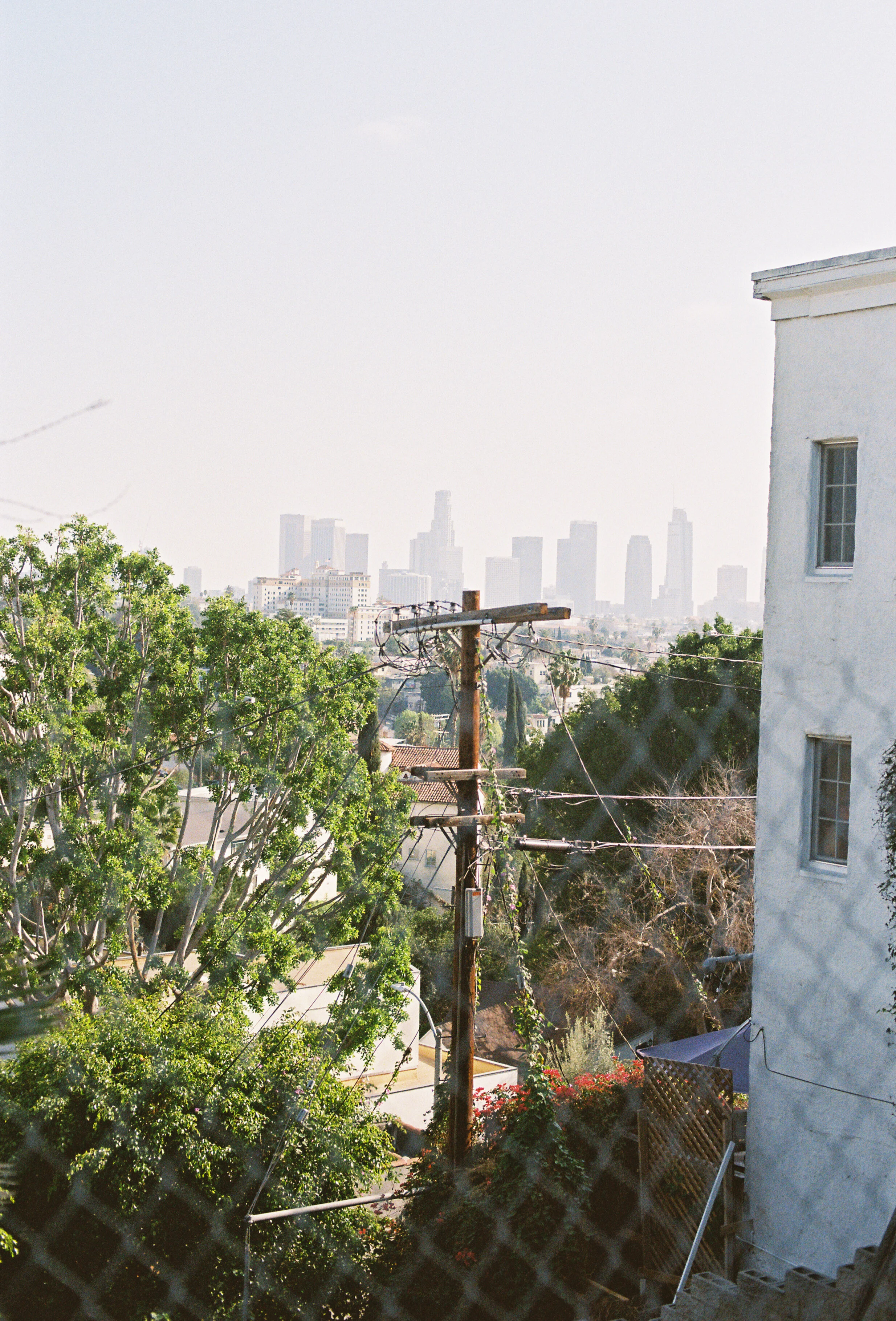
Looking at the two films, they are very similar to one another at first glance, the differences are surprisingly minimal. Starting with this first image of Los Angeles through a fence, the main thing I notice when really starring at this image is the Portra seems to naturally have a bit warmer white balance. The wall on the right definitely looks to have a slightly blueish hue to it. The green leafs on the tree on the left of the image also looks a bit warmer on the Portra roll.

In this second image with the Orange truck, I see few very obvious differences between the two images. The shadows on the Portra roll are very blue/green in comparison to the shadows in the Ultramax image, secondly we’re definitely getting those “pastel” tones from the orange on the Portra roll compared to the puncher more contrasty orange on the Ultramax roll.


With the image of this house, the colors on the Ultramax are much more vibrant and standout much more than they do on the Portra roll. The contrast difference is pretty drastic as well. We love the color we’re getting from the Ultramax but we also prefer the contrast from the Portra.


This image of the tree and the window is a perfect example of how similar these two films can look in good conditions. We had to look at these two side by side for a few minutes to spot any difference, the shadows of the Ultramax roll do seem to have a yellow/reddish hue to them whereas the Portra roll looks more true to life.


Here in this image, if we pixel peep its easy to see the Ultramax does have a lot more grain than the Portra does. We also see the same differences we’ve been seeing in this comparison. The Ultramax is a lot punchier both in color and contrast while the Portra roll has much more subtle tones throughout its image.


The subtle tones of Portra seem exaggerated in this image of this house, the colors almost look like someone pulled down the saturation when compared to the Ultramax.


Same story in this image of the Mustang, the colors and contrast are so much more pronounced on Ultramax than they are on Portra. I think what this tells us about these films is Portra is meant to be flexible, it’s a low contrast, low grain, and very subtle color film to use in any lighting situation, so no matter what you’re shooting no one factor is overbearing whereas Ultramax is a punchy color film that is meant to produce great images in a daytime setting. That’s not to say it can’t handle being pushed/pulled or be used in an extreme or obscure lighting set up but it seems to exaggerate color casts and contrast more than Portra so it won’t be as flexible in these types of scenarios.


To wrap this up, we think both these films are amazing and we don’t look at one as “Consumer” or “Pro” grade films. They both serve a difference purpose from one another. We think shooters can use either films in a lot of the same situations as long as you know what you’re going to get with either one. If you want those “airy & dreamy” wedding photos we’d lean towards Portra but maybe you’re shooting portraits at golden hour, the exaggerated gold hues from the Ultramax may fit the bill better. We suggest giving them both a try and seeing which one fits your needs!